
In 1564, a man called Michel Mayer seems to have had a rather eventful June. A weekend visit to a brothel got rather out of hand: he went on a Sunday, stayed through Monday, Tuesday, and Wednesday, returning to his lodgings on the Thursday, where he ‘went to sleep on a box in his room’ and then, it seems, summarily quit his job, ‘packed his things and left the establishment without saying a word to anyone’. No hard feelings: his boss, Christophe Plantin, a well regarded printer in Antwerp, re-hired Mayer some time later.
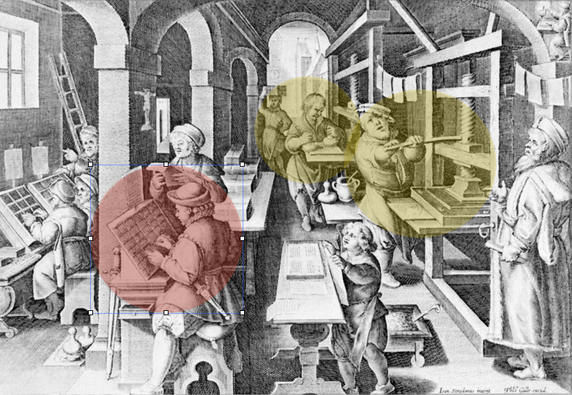
It may be that I’m not asking the most interesting question possible of this anecdote, but here goes: what does this tell us about Mayer’s job? He was one of Plantin’s compositors, tasked with assembling a given text piece of type by piece of type: that is to say, for each page of text that Mayer set, he would have arranged a piece of type for each individual letterform, each punctuation mark, each space. In the image below, Mayer’s occupation would have looked very like the man in the red circle’s: once he’d set out the ‘forme’ of his page, the man to his right would apply ink; the man to the right of that is manning the press – a sheet of paper forced down onto the forme, raised again, Mayer’s work now impressed upon the sheet.
When not in a brothel or asleep on a box, how attentive was Mayer to his work? Joseph Moxon – importantly, perhaps, a printer himself – suggests that compositors were capable of considerable attention and no little sensitivity to the text they were working on:
A good Compositor is ambitious as well to make the meaning of his Author intelligent to the Reader, as to make his Work shew graceful to the Eye and pleasant in reading. Therefore, if his copy be written in a language he understands, he reads his Copy with Consideration; that so he may get himself into the meaning of the author, and consequently considers how to order his Work the better both in the title page, and in the matter of his Book: as how to make Indenting, Pointing [punctuating], Breaking, Italicking, etc. the better sympathize with the Authors Genius, and also with the capacity of the reader.
Joseph Moxon, taken from Roger Chartier, Inscription and Erasure: Literature and Written Culture from the Eleventh to the Eighteenth Century trans. Arthur Goldhammer (Philadelphia: University of Philadelphia Press, 2007) p. 30
This description models a very active kind of engagement with the text: the compositor may ‘get himself into the meaning’; he both ‘reads his copy with consideration’ and ‘considers’ how to order the work better. This figure considers, gets into, makes; this figure, overall, draws sympathetic understanding between the ‘author’s genius’ and the ‘capacity of the reader’, showing no little sympathy and understanding himself in doing so.
This, of course, is an account of a ‘good compositor’, and Moxon may have thought such commendable practice incompatible with falling asleep on a box during normal working hours. Indeed, the figure of the drunk compositor has come to jostle with the figure of Moxon’s ‘good compositor’ in later views of the early modern print shop. Consider Anthony Grafton’s account of this engraving (originally made by Moses Thym and found at the beginning of Jerome Hornschuch’s Orthotypographia (Leipzig, 1608):
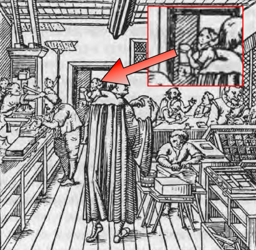
In one small room a compositor sets type, a corrector reads copy, a warehouseman sorts paper, a printer and an inker work a handpress, and a workman lifts wet sheets to dry on a ceiling-level rack. In the background, a girl comes through the door, clutching a jug of beer, the pressman’s traditional perquisite; in a corner, an author speaks excitedly to an unidentified companion. In the foreground, dominating the scene, stands the master-printer—a majestic, Prospero-like figure, who seems to be counting on his fingers.
Anthony T. Grafton, ‘The Importance of Being Printed‘, Journal of Interdisciplinary History XI:2 (Autumn 1980), pp. 265-86, p. 265 (my emphasis)
In such views of the early modern print shop, ‘the pressman’s traditional perquisite’ comes to stand for an element of chaos and unconscious action in the composition of the text. Looking over the 1592 quarto of The Spanish Tragedy printed by Edward Allde, Thomas W. Ross, for example, noted a ‘series of wrong fonts’, a ‘sudden decline in typographical harmony’, and an ‘increase in mistakes – not bad enough, yet, to make nonsense of the lines, but half-literate or ignorant’.
Perhaps alcoholism was an occupational affliction of printers as it is (so they say) among housepainters today. […] in Allde’s printing house there was probably a sufficient measure of noise, horseplay and brown ale — perhaps too much.
Thomas W. Ross, ‘Kyd’s ‘The Spanish Tragedy’: A Bibliographical Hypothesis’, The Bulletin of the Rocky Mountain Modern Language Association 22:2 (Jun 1968), p. 1
This musing from Ross, apparently someone who wasn’t enjoying the swinging sixties at all, is odd, and – because so odd – something I’d like to keep coming back to. Opposing Moxon’s good compositor not with a straightforwardly bad compositor but a more specific figure -that is to say the drunk compositor – betrays an important uncertainty at the heart of how twentieth- and twenty-first century editors think of early modern compositors and their work.
Looking over the 1609 edition of Shake-speares Sonnets, for example: is it possible to ascertain whether George Eld’s compositors were carefully considering how to ‘better sympathise with the author’s genius’, or recently returned from a brothel, still smelling of beer, having slept on a box? Taking a wider view, bibliographers will always struggle to pinpoint the exact quality of care a compositor was able to instil in the presentation of the text. Gaskell’s summary of a compositor’s labour is instructive (an ‘en’, for reference, is the measurement of a small piece of type the width of a lower case ‘n’):
From 1785, when a scale of prices for piece-work composition was laid down in London, right up to the present century, a ‘normal’ rate of 1,000 ens per compositor per hour was postulated in England, this rate including the distribution of an equivalent quantity of set type and the correction of the compositor’s own mistakes. Distribution (which took from a quarter to a third as long as setting) and correction both took time, so that this rate actually involved setting at 1,500 ens per hour or more.
Philip Gaskell, A New Introduction to Bibliography (Oxford: Clarendon Press, 1985) p. 54
On the one hand, a compositor is trying to set their type as quickly as possible: they were paid by amount, not by quality. On the other hand, Gaskell points out that the compositor’s rate of production also had to accommodate ‘distribution’ (returning the pieces of type to their cases once a given sheet had been printed) and correction – in other words, most compositors would be trying, even if hurriedly, even if not succeeding, to avoid outright ‘half-literate or ignorant lines’.
For these reasons and more, editors still tend to abide by W. W. Greg’s division of textual features into ‘substantives’ and ‘accidentals’ when they modernise early modern texts. Writing in 1950, Greg sought to distinguish between the aspects of a text which ‘affect the author’s meaning or the essence of his expression’ – substantives – and ‘accidentals’: ‘spelling, punctuation, word-division, and the like, affecting mainly its formal presentation’. In this regard it doesn’t matter whether a compositor is perceived as being an erratic presence like Mayer, or a thoughtful figure more like Moxon’s: both are non-authorial agents of interference, whose work on the ‘formal presentation’ of a text can be disregarded, changed, ‘modernised’, by any editor who considers themselves better able to ‘sympathize with the Authors Genius, and also with the capacity of the reader’.
The figure of the drunk compositor is especially useful for modern editors because – counter-intuitively, perhaps – a drunk person might occasionally say or do meaningful things, albeit inconsistently. Even Thomas W. Ross at his grumpiest conceded that the work of Allde’s team was ‘not bad enough, yet, to make nonsense of the lines, but’, he insisted, ‘half-literate or ignorant’. Somewhat annoyingly, the ‘formal presentation’ of Shake-speares Sonnets doesn’t seem consistently ‘ignorant’: some features, in fact, seem to tease us with the possibility of a very Moxony sensitivity to the stuff of the poem. Consider this, sonnet 126, often taken to be the final address to the figure most often known as the ‘fair youth’, with sonnets 127-154 going on to offer themselves instead to the so-called ‘dark lady’.
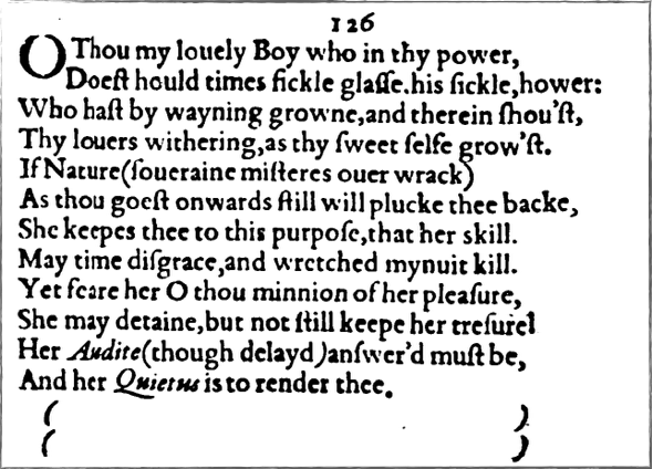
Do not adjust your sets: this is a sonnet only technically 12 lines long – written, unusually, all in rhyming couplets – with the phantom final thirteenth and fourteenth apparently enclosed in brackets. Many, many editors and critics find these brackets just too deliciously interesting to ignore: these brackets ‘resemble marks in an account-book enclosing the final sum, but empty’, according to Katharine Duncan-Jones, they ‘sketch out the shape of an hourglass, but one that contains no sand’, in René Graziani’s view, while for John Lennard they may ‘image a repeated waxing and waning of the moon, pointing to fickleness and frailty’, or figure ‘the silence (quiet) of the grave, or the empty grave which the corpse of the “louely Boy” must sooner or later fill’. All such readings are in keeping with the sonnet’s overall message, as the speaker dramatically takes his leave of the ‘fair youth’. And yet these particular pieces of type were put into a composing stick and then into the forme not by Shakespeare but by some now-anonymous person in the employ of George Eld, and we don’t know now whether that person was more or less faithfully replicating what Shakespeare had put down in manuscript. Would you include them? John Kerrigan didn’t (for his Cambridge edition). Colin Burrow did (for his Oxford edition). Stephen Booth didn’t (for his Yale edition).
Whatever these brackets might figure – marks in an account book, an hourglass, a moon, a grave – and whether or not these brackets should be taken as a deliberate illustration of something, it’s indisputable that they draw our attention to the idea of absence. ‘Though ll. 11-12 make a perfectly complete sentence,’ Katherine Duncan-Jones observes, ‘they leave the reader with a sense of incompleteness or sudden ending, which is reinforced by the empty parentheses which follow, as if they figure the emptiness which will ensue’. A quietus, the OED says, is ‘an acquittance or discharge granted on payment of a debt; a receipt’, or else – citing Shakespeare as the first example of this usage – ‘a release or respite from life; an ending of life, death; something that causes death.’ There’s a volatile interrelation between presence and absence in the poem’s closing: in her final act, Nature may render the fair youth, or may render the fair youth as the absence on the other side of the full stop.
Were Eld’s compositors rubbing their chins and writing blogs about this sort of thing when they finished their day’s work? Probably not. But it may well be the case that Shakespeare wanted his readers to be reflecting on the two versions of the poem co-present on this page – the one printed, the other, origin text that might be reflected more or less imperfectly here before us. In line 2 we’re invited to think on ‘Time’s fickle glass, his sickle hour’: most editors think of Time’s hourglass at this moment (this, indeed, particularly animates Graziani’s reading of the brackets-as-empty-hourglass across lines 13 and 14). But a fickle glass might also be a mirror: not simply faulty, but fickle, inconsistent, unreliable. Going so far as to tease his reader with that idea of a mirror, inviting us to wonder how much the fair youth’s appearance might or might not be a true reflection, so too is the poem’s appearance presented as something that might or might not be trusted. What ought we to make of ‘sickle’, so close to ‘fickle’, used very unusually here as an adjective – describing a ‘sickle hour’? Have the compositors set a long ‘s’ when they were meant to repeat ‘fickle’? Has good old genius Shakespeare dug out from somewhere a near-obsolete Middle English term meaning ‘sickly’? Or – still more geniusly – has Shakespeare simply made up his own word, preferring ‘sickle [adj.]’ to the far clunkier and far less interesting ‘sickle-like’ (thankyou, OED).
This is far from saying Shakespeare was there in the print-shop carefully overseeing the placement of the ‘f’ and the long ‘s’ in line 2 of sonnet 126; and, as unusual and as interesting as the brackets are, nor can we be any more sure that Shakespeare was the person responsible for their now being there in the printed text. Nor can we be sure of the precise extent to which Eld’s compositors were thinking through these features. Nor can we be sure that Shakespeare offered this figure of the ‘fickle glass’ confident that his manuscript would be changed by compositorial craft (at one extreme) or epic print-shop boozehoundery (on the other). But it’s hard not to read sonnet 126 and suspect that, in drawing out its thoughts on appearances which change over time, Shakespeare had in mind the medium he was writing for. This, the printed book, is time’s ‘fickle glass’.
Next week I’ll be discussing Sonnet 116 (‘LEt me not to the marriage of true mindes’) – click on the link to visit Internet Shakespeare Editions, where you’ll find a facsimile of the poem as it was printed in 1609.

[…] when we try to interpret the relationship situations that it describes. As I mentioned in last week’s instalment, it’s not unusual that a critic or editor operating today might distrust the particulars of […]
LikeLike